Blog
Case Study: DrayNow App UX
Zach Ferdman is a UX/UI designer who helped design the current DrayNow mobile app. He wrote this case study on his experience working with the engineering team to develop this product.
Background
DrayNow is an innovative technology company that has transformed the intermodal freight industry by creating an online marketplace for brokers and carriers to work together. Brokers needed carriers and carriers needed new loads to increase their earnings. DrayNow developed a beautiful and well loved web and mobile application for the two parties to connect, and understood the grand potential of placing this marketplace into the hands of all of their carriers around the country. Creating a mobile app would produce a more personal, clear, and efficient experience as well as generate more revenue for the company.
DrayNow did have an existing mobile app. I was approached with the task to collaborate with the DrayNow product and development teams to redesign the app to be the experience carriers were craving.
Approach
After research and education of the user-base, it became clear that there were a solid amount of constraints to consider: users would be occasionally monitoring the app while in transit performing jobs, were consistently hitting actions by accident, and were consistently forgetting their password. Furthermore, large chunks of information had to be presented and we needed to convince users to enable certain OS permissions in order for the app to function to its full potential. DrayNow also had a specific approval process we had to account for when users were signing up.
In order to accomplish the end goal of redesigning the DrayNow app to make it the carrier’s best friend, we had to be intentional with our information hierarchy, cognizant of accessibility, and aware of the environments in which the app was going to be used.
UX Strategy
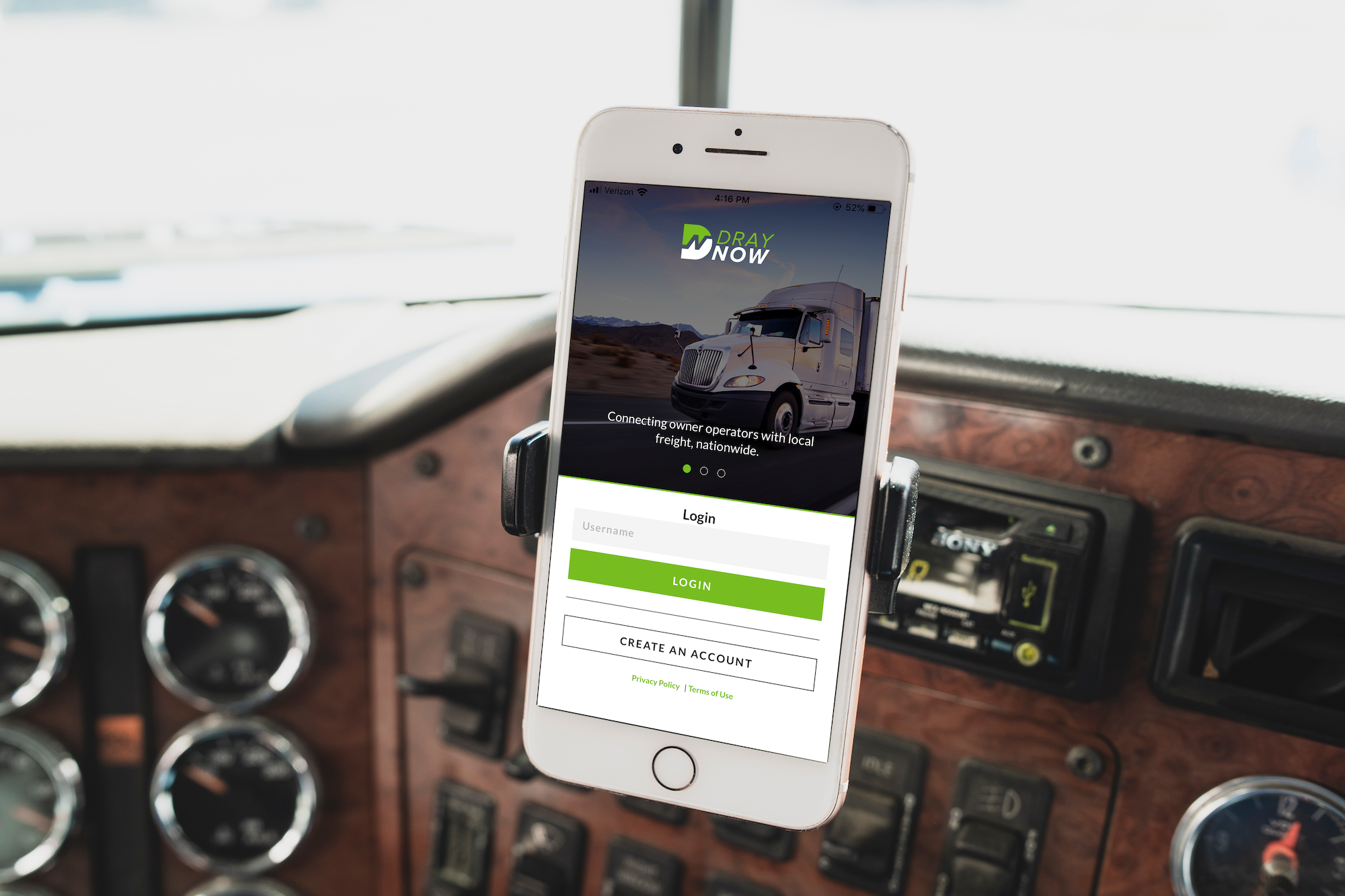
One of the first areas we worked on was the login. As mentioned, users were having difficulty remembering their password when logging in. To address this, we utilized a “magic link” login which would email a login link to the user so that they didn’t have to worry about a password. However, we still keep to option to login with a password available. To remedy the larger issue of users being logged out or accidentally logging out after using the app, we added in a “log out” button to the settings tab.
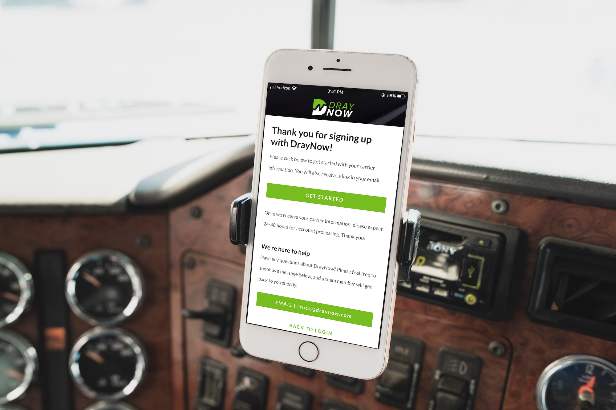
The new onboarding process involved a simple email registration followed by a short questionnaire to gather essential profile information for DrayNow’s backend. We created a waiting area page that would be a landing screen for users to learn more about DrayNow while their information was quickly being processed.
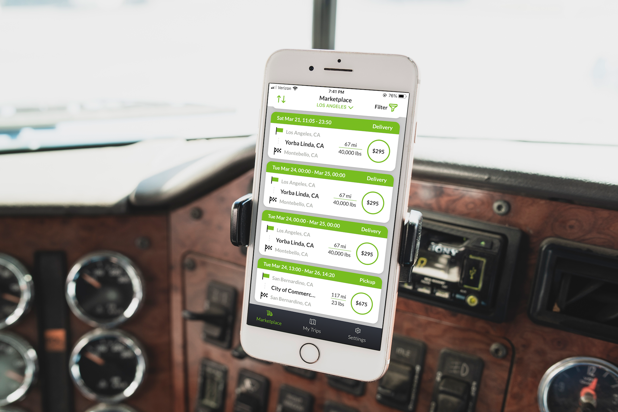
The marketplace screen was the meat-and-potatoes of the app. This is where carriers would type in their location and search for jobs to take on. The team’s highest priority was fitting as many loads on screen as possible. We bounced between two columns of square cards and one column of rectangular cards. We ultimately went with the latter. Firstly, there were a lot of data points that the carrier needed to see up front to decide whether they would view more info about the load. Therefore, we needed to keep things appropriately spaced-out and legible. Secondly, the two-column approach proved to be too much information. We needed to stay in tune with our initial design principle of not overwhelming the user. The team was very happy about the final result (although we did tinker around with it a bit during the UI phase).


Another aspect of the marketplace was requesting trips. We wanted to account for both new users and DrayNow power users. Trips could be requested by a simple swipe on a marketplace card or by tapping into the card for more info and then tapping the “Request” button. Once requested, the trip would await approval in the My Trips section of the app.
The My Trips section was an interesting challenge. Our initial design separated loads (the vernacular for a posted job, essentially) into three distinct tabs: in progress, ready, and pending. Visually, and according to our hypothesis, this design seemed the most natural. Upon testing, we discovered it wasn’t as harmonious as we hoped for the carriers. We went back to the drawing board to iterate based on our feedback and went with a scrolling list approach in lieu of tabs. Now, a user would have their “in progress” loads at the top, followed by their “ready” loads, and ending with their “pending” loads.
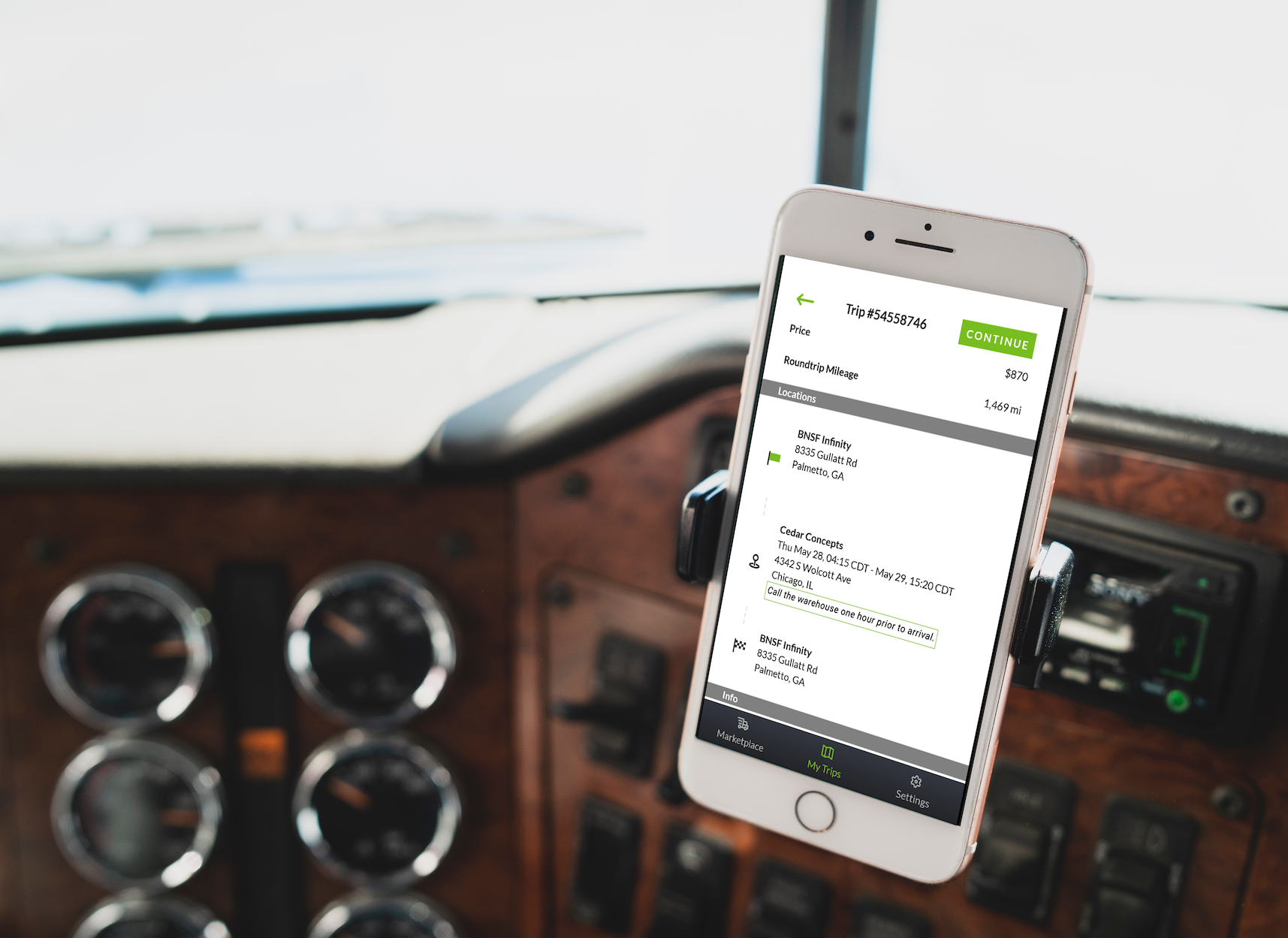
Once a carrier began a trip, they would be launched into the trip execution piece of the application. The trip execution had to be straightforward for the carrier. For context, carriers would receive loads to deliver to a location for the shipper. Once arrived, they would need to account for certain documentation and additional tasks that arose along the way. We wanted to capture every step of the trip in the mobile app so that the carrier could perform the entire trip (other than the driving, of course) within the DrayNow app.
Using GPS tracking, carriers could progress through trip steps simply by arriving at their locations. In the event of poor connection, we included a “next” button. Users could enter all of the information and accessorial into the app which would then be transmitted to the platform, essentially making the whole process digital and documented in real-time.
Design-wise, we knew it was necessary to limit each step to its own screen. This way, the carrier could focus on one element at a time. We also included a progress bar to motivate the user and give a realistic analysis of how far along the job they were. Secondary tasks, such as adding accessorial, were made less prominent in the hierarchy so that the focus was on the primary task.
To ensure that trips were correctly executed, we provided the essential instructions up front with any special instructions that could be triggered via a button. Steps could not be completed unless the special instructions were viewed.
UI Strategy
After wireframing, prototyping, and documenting the product flow, we received our stakeholders’ enthusiastic approval. Our goal for the UI was to adhere to the existing DrayNow design system while also leaving room for future additions and ideas, such as card styles. Another priority of ours was to make sure that each screen was perfectly legible and not too congested that users would fall into consistent ‘mistaps’ again. Our final product ended up being a beautiful extension of the DrayNow brand. We ended up adding in some icons to give the app a friendlier feel and to also communicate certain actions visually rather than textually.
Conclusion
After testing the new prototype with real DrayNow carriers, we made some minor visual adjustments. The team now had a tested product that was ready for development. We were all so excited about this new, easy to use app and we knew the users would be too.
It was a great experience working with an established company’s product, development, and research teams. There’s a fun and lively dynamic that you get to be a part of, not to mention how much you learn from each individual you collaborate with. It’s important to hear each person out. Every voice matters and I learned specifically from this experience that it’s important to explore edge cases. Though it may put more constraints on design, in the end, it’s all about the user and giving them an effortless experience.
You can find Zach’s case study and the rest of his work by visiting his site.
Sign Up
Shipping Freight? Get our new E-book.
Download our free e-book "Is there a future for Intermodal Marketing Companies?" and get DrayNow updates delivered straight to your inbox.
"*" indicates required fields